I have just finished rebranding my freelance web development studio. For any re- branding there should be a common area 90% of the cases you start from the logo. For my case, I start from the
(1) logo (2) then, move towards my website (3) then, move into all the social signatures which now have the same banner for my Facebook, Twitter, LinkedIn, Instagram. (4) lastly the business card with same same feel as the website.
I am a big fan of branding. Good branding can really create an unique portfolio and help to close contracts more faster. Does not matter the size of the agency good branding can make a small company lift up to their big name competition.
(1) logo: my old website have a black and white theme with logo which is consists of two fonts “Saurav” uses the Raleway bold with black color and “Pro” uses the font Calibri italic with color in red, below that the tagline ” freelance web development studio” in different font called Bittler Bold. Keeping the basic logo branding the same I have added the letter s|p tilted like an arrow uses the Raleway Bold for consistent look and feel like the Saurav. Also made a very subtle difference in the color grid than the previous logo. Also the tag line is made a little rustic with the introduction of a subtle noise. Like to portrait that I am in the business for sometime.
(2) my website: as mentioned my previous website is black and white with specks of colors here and there which creates an amazing effect. Like to keep that tradition as clients visiting my website loves it. The main drawback of my previous website is its not responsive and there are some features and plugin of WordPress always gives error when updating, also the website is very slow ( at times it’s like the turtle speed). So those are the stuff want to improve on. The design of the new website emphasizes on the introduction of images which have dots and pretty washed up, used different textures specially on the footer which has scratches giving the overall impression of old, on the main slider used the very old images on Vancouver which is photoshopped and added the photo grain giving it the impression of old. Also all the icons are used are all treated the same way. All the images of the website including portfolio as well as the blogs are color corrected to give it an impression of old. Special care is taken on the portfolio images as I don’t alter it too much so the essence of the work is not destroyed.
(3) social network: after the website is finished to my satisfaction, then I have taken branding to the next label all my social signatures like Facebook, Twitter, linked in, Instagram changed into the same header and the look and feel like my website. It’s very important transformation. To have products which are similar in look and feel like your website.

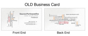
(4) business card: after all the online business signature are changed one most important changes I need to under go is my business card. Tried to have the same look and feel as the website. The logo have some hiccups as the colors don’t match the Pantone Grid of the offset colors so I have done some redoing of the logo. Then comes the font issue, I used the font “28 days later” a graphic font for main name and the designation. For the email, phone numbers used the font “Acionica Regular” — liked it more shape of the font. For the website I used another graphic font called “CabinSketch Bold” — want to use 28 days later but the font is lacking the special characters. Also the front and the backend of the business card uses noise in white as the background texture same like the website. On the front end, bottom corner I used the same texture as the website menu on rollover (orange texture) — but need to manipulate the color a bit to match its near by Pantone grid for printing. Also the backside have a light sketch of me in grayscale with a subtle noise. Also have all the social signatures are listed on the back side of the card.
Juke Box Print Did a very good job in printing the business card.
